Huddle Search Enhancements
Background
Huddle is a document collaboration product that is well used and liked across numerous industries. Customers include huge tech organisations, energy companies, the public sector, and many more. It’s also used internally by Ideagen.
Customers can upload, manage, and share documents across their organisation while also creating workflows to facilitate document review and sign-off.

The problem
Customer needs & requirements


Despite it’s popularity, Huddle is showing it’s age in both design and functionality.
Customers contact Ideagen regularly to request changes and enhancements to help make their lives easier when carrying out the tasks they need to do. One of the main requests we receive is regarding the search functionality.
Customers may have thousands of documents spread across hundreds of separate workspaces within the system. This means customers are forced to search for them, but the old search function wasn’t up to scratch. The biggest headache for customers was that the search closed each time a search result was selected and viewed. This meant the user would have to re-search each time they wanted to look for another file.
Challenges and limitations
Myself and the team had a couple of major limitations with this piece of work:
Timescale: The research and design work had no more than 2 weeks to be completed
Look & feel: The product has is own look & feel and a dedicated existing customer based. Any changes couldn’t take the product experience too far away from where it was so major UX/UI changes were off the table
Based on previous customer contact, the Product Management team provided the following requirements and needs.
Add more filters on File View
Allow filters to search all sub-folders
Allow a quicker way to search within the current workspace
Need a way to save historic search results so I can run them again
Need a way to keep an historic record of files I have accessed
When the search results are returned I do not want to re-run the search each time to go through the list of results
Search should give me a choice of where I want the search to look: file title, file body only, both
To launch the search window I need to key in a search word first. I should be able to launch the search window right away
There are too many clicks to search within the current workspace I am in. I want to search quickly within my workspace
Search should suggest filenames as I type into the search field
More filters in the searches such as file type, owner, date created
Being able to access the workspace or folder the file is located in once the search comes back

Discovery & user research
We had many calls and emails from customers outlining the core issues, however I wanted to hear it directly from the users themselves. I engaged with one of our User Researchers as well as the Product Manager in order to set up user interviews with both internal and external users.
We carried out 6 interviews in total allowing us to understand first hand the challenges and pain points experienced by our customers while giving us a glimpse into the way they work.
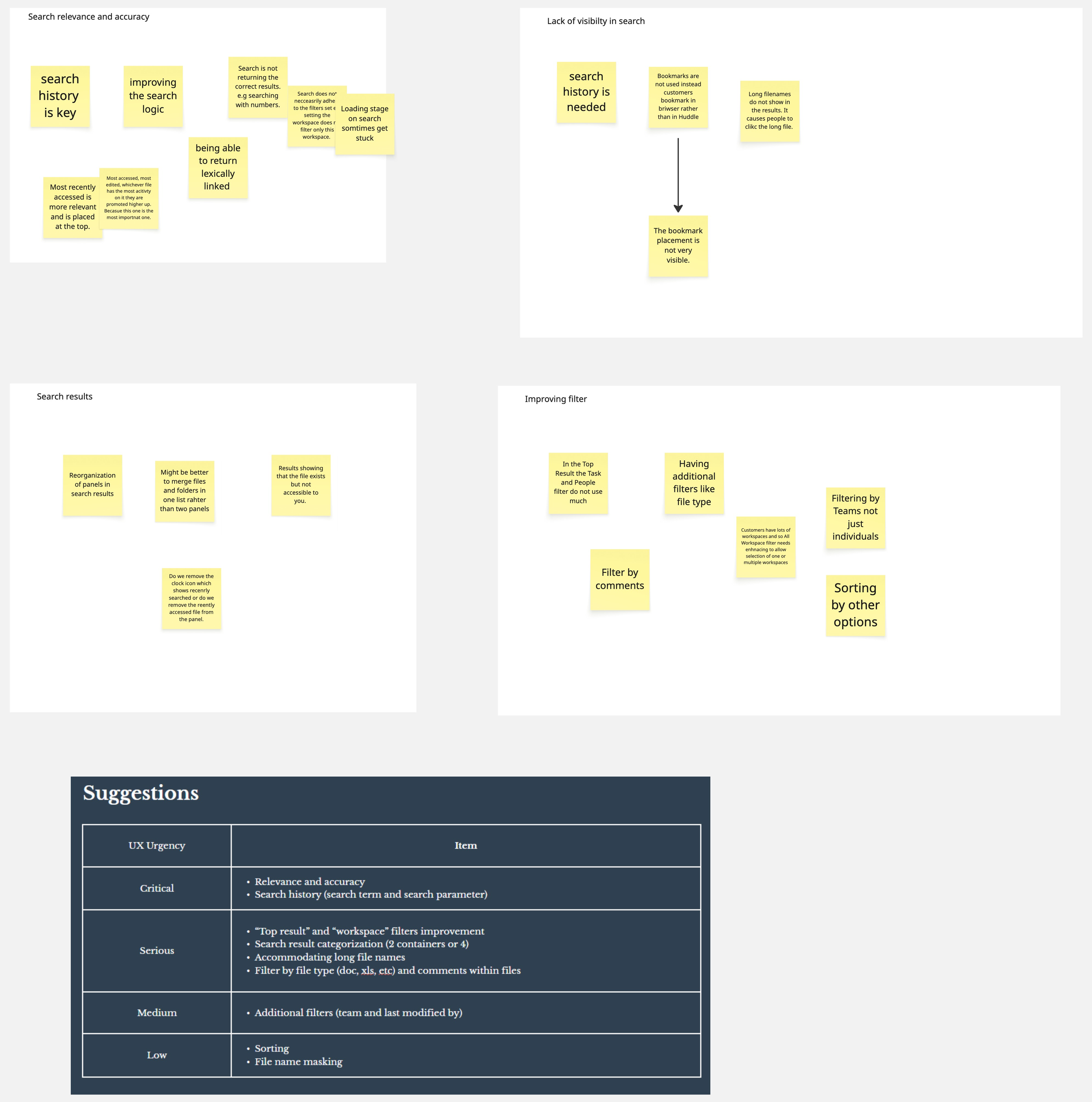
Taking the feedback and insights provided by the users we did a card sort to put the findings into relevant category groups. These were, Search relevance and accuracy, Lack of visibility in search, Search results, Improving filters. This confirmed most of the original requirements provided via the business.
From this I created a list of key UX improvements prioritised by how important these were to the users.
Design and iteration
Original search panel dropdown filters

Early conceptual journey

This initial concept tried to maintain the original look of the product but introduced additional functionality:
The ability to open the search panel before entering a search term
Shows recently accessed files and recent searches
The search panel can be collapsed without losing the current search results meaning customers can go back without having to re-search.
Usability testing


The final iteration includes the first changes that were made and builds on the initial concept by making changes that were important to the users while maintaining the overall look & feel of the product.
Addition of a sorting function
Ability to bookmark results
Due to time constraints we could only test with a hand-full of internal users. This helped us to confirm we were on the right track and identify where we could improve the design.
User’s liked the ability to be able to go back into the search and seeing recent searches, however they felt the result filters were limited and easy to miss for those users who may be less familiar with the system.
Filters made more clear so users can see they are filters
More filters added
Moved to a vertical left-hand area for better use of space
Final design
These changes are currently in development with a view to them being released in Q4 2025. Initial reception by stakeholders and customers, outside those involved in the project, has been very positive when shown the designs.
Impact will be measured through direct customer engagement via customer support, account managers, and product managers, and customer satisfaction scores.
Result and impact
Different object types moved into tabs rather than having them all shown together