Audit Planning
The problem
Customer needs & requirements
Audits can be planned in numerous ways depending on how that particular customer operates. Users need to be able to plan their audits in advance maybe years at a time, but also some may want to create and execute audits at short notice as need arises.
How can we offer an easy solution to users that gives them the flexibility to create and arrange audits in whichever way is the most suitable for them?
Challenges and limitations
Timescale: This was needed quickly for release to customers.
Look & feel: As designers, we were bound by Ideagen’s brand design system. We’re also building on an existing product so have to follow previous conventions meaning little room for exploration in design.
Technical limitations: Due to the way the back-end was constructed (micro-services with numerous databases), firing many API calls across the system could affect performance.
Accessibility: Due to the complex, and information dense nature of the product it’s difficult to maintain a high level of accessibility at all times.
The following high-level requirements were based on Subject Matter Expert opinion, industry best practice, and matching functionality within the older products that this replaces:
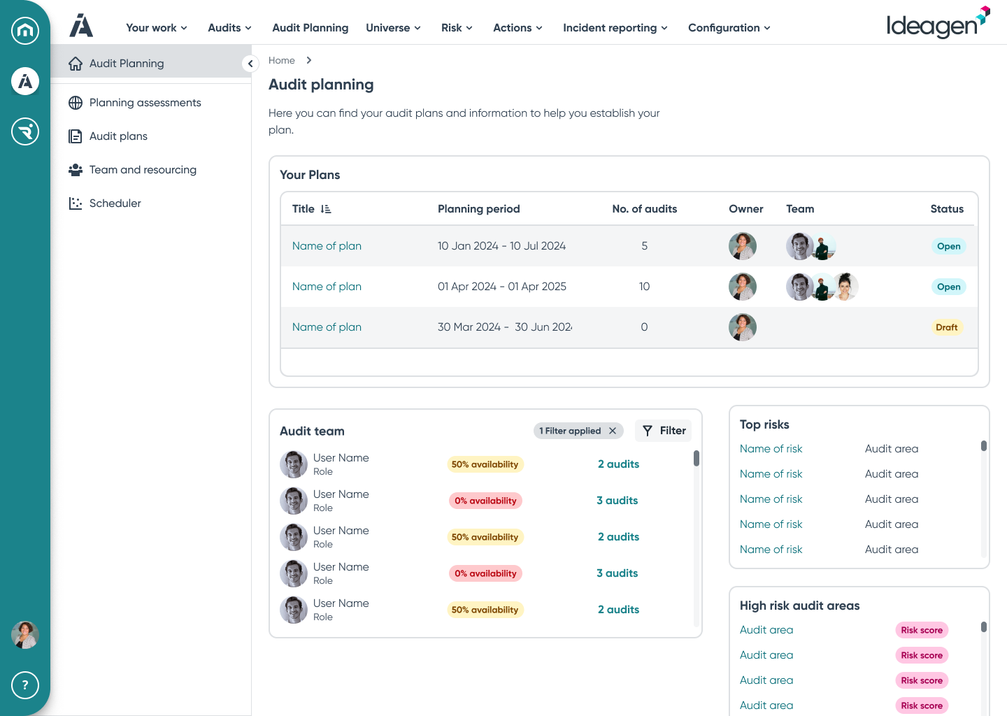
Group audits into an audit plan
Display risks from the universe and allow them to be selected for an audit plan, and then allocated to audits within the audit plan
Display locations from the universe and allow them to be selected for an audit plan, and then allocated to audits within the audit plan


Discovery & user research
Myself and one of our researchers spoke to 5 users as part of the discovery work. We aimed to understand the way in which they worked, planned and executed their audits and what their expectations and needs were for the product.
The users were spread across several different industries and sectors, including public bodies and private companies.
Our findings revealed that most were working in a way that was unexpected. The expectation was that users were planning audits based on a location within their organisation. The reality was that most were planning based on the severity of risks within the organisation but this wasn’t location dependent. This was different to what we and the wider project team assumed.
These findings were used to inform my user journey maps of the proposed solution.
Design and iteration
After doing some research into various visualisation methods, one option I considered was having a ‘block’ type timeline with the user able to switch views between year or month views.
My initial designs focused on providing users with an effective way of creating audits based on the risk profile of their organisation. This would allow them to view, update, and select the risks that were of interest and pull these into an audit and audit plan.


Iteration


So far customer feedback has been positive. Analytics aren’t currently available in the product due to a technical issue though so monitoring engagement is difficult at this point. As soon as engagement numbers are known, I’ll add them here.
Result and impact

One of the main requests from users was the desire to have a visual representation of the audit in the plan they created.
Initial usability testing
Our user researcher, another UX colleague, and I took these initial design concepts to users. We showed them the journey and asked them whether this would fit into their ways of working.
Despite this being unfinished and rough round the edges, results were positive. Users felt that we were moving in the right direction and that what I was proposing as a solution would largely work for them.
I went away from this with ideas to enhance and improve the journey while maintaining the positive aspects the users liked.
More usability testing
We spoke to a further group of users to get their thoughts on the latest iteration including the timeline visualisation.
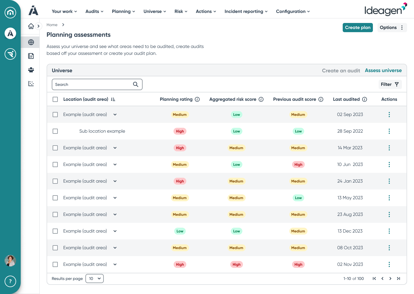
Users like the ability to see the timeline clearly. One request that came from them at this point was to be able to amend the audit date using the chart rather than editing the audit itself.

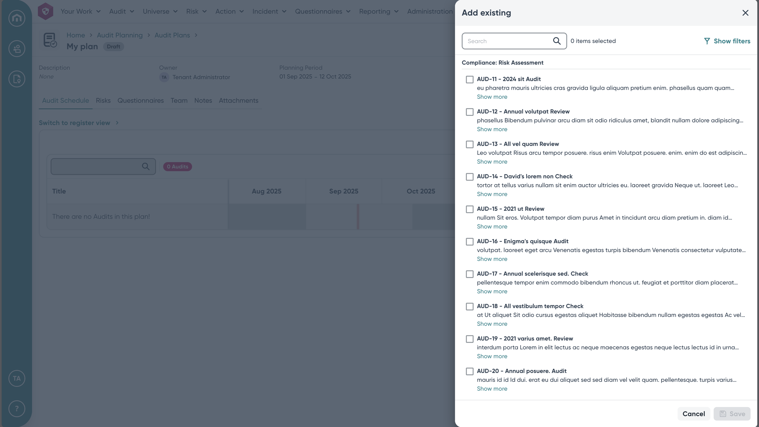
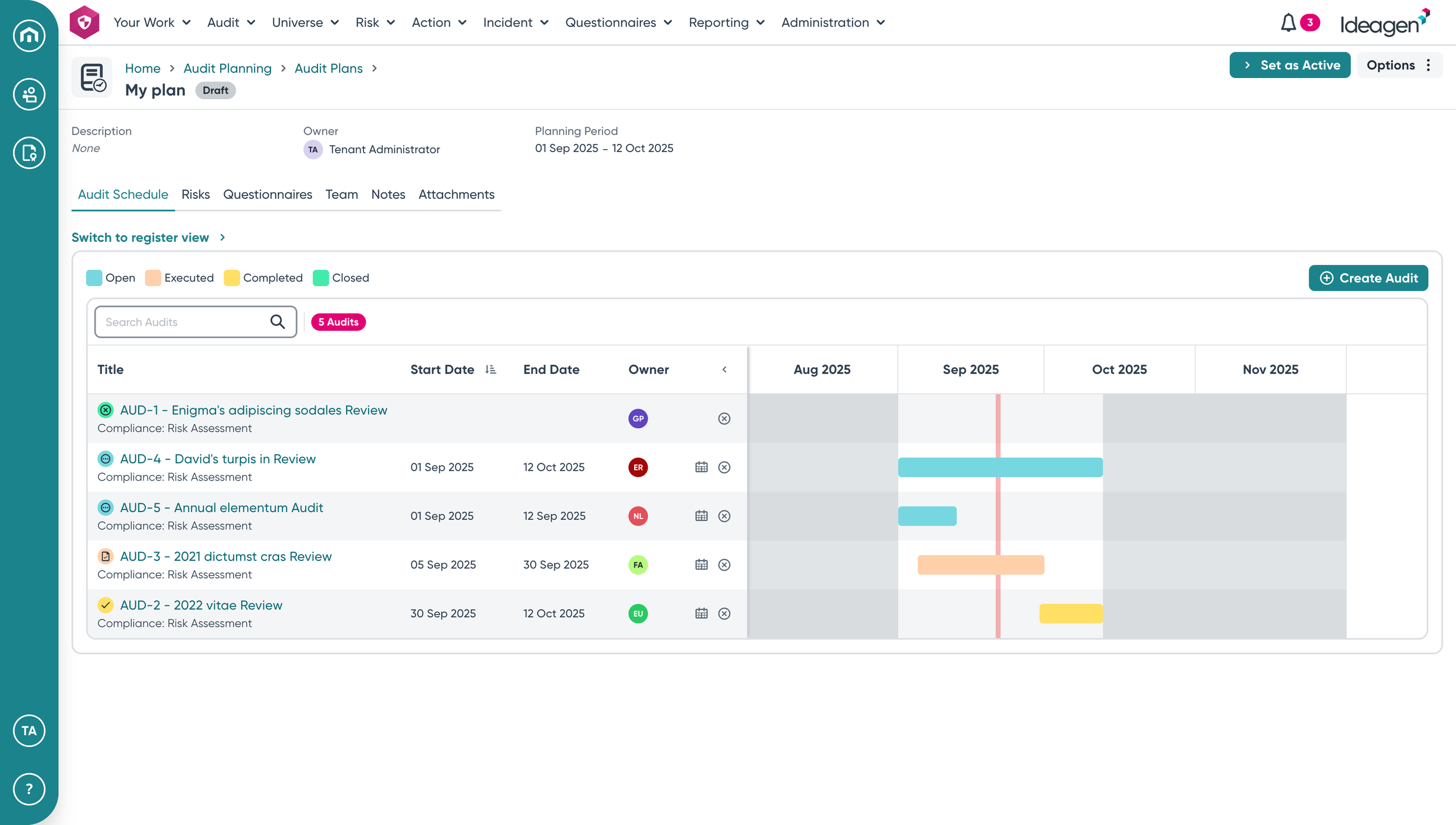
Users are able to create and name an audit plan and give it a duration.
They can add existing audits to the plan or create a new one as needed.
Once users are in the plan, they have a clear gantt chart style view of where the audits sit in relation to each other.
They can amend the date of each audit by moving the bars in the chart.
After option was to have a more traditional looking gantt chart with traditional bars showing the audit duration.

The initial concepts and ideas for the piece of work were maybe a little over complicated. Business opinion was that this needed to be a massively complex and sprawling solution to a problem which they believed to be difficult to solve easily.
Our user research showed that users were actually looking for something simple that they could easily adopt and doesn’t require micromanagement. Although every screen and design isn’t shown here, the overall journey is simpler than originally expected but it solves the main problems for users.
Final design